Lexi Watts

Analyst | Background in FinTech, B2B, SaaS, and Biostatistics.
View My LinkedIn Profile
Welcome to My Portfolio
Recent Projects
SQL Healthcare Data Analyst Insights
Dive into the details of a fascinating project where I utilized SQL to uncover valuable patterns in patient data.
From identifying top-performing medical specialties to revealing correlations between visit duration and procedure frequency, this project has been an enriching experience. Check out the article above to explore more.
SQL Heart Disease Insights and Analysis
 Here is my final project for the Data Career Jumpstart program! I chose to delve into healthcare analysis, specifically exploring the relationships between heart disease, age, and other health metrics. My passion for data analysis, combined with my background in public health, guided me to this impactful subject.
Python Quality Prediction in a Mining Process
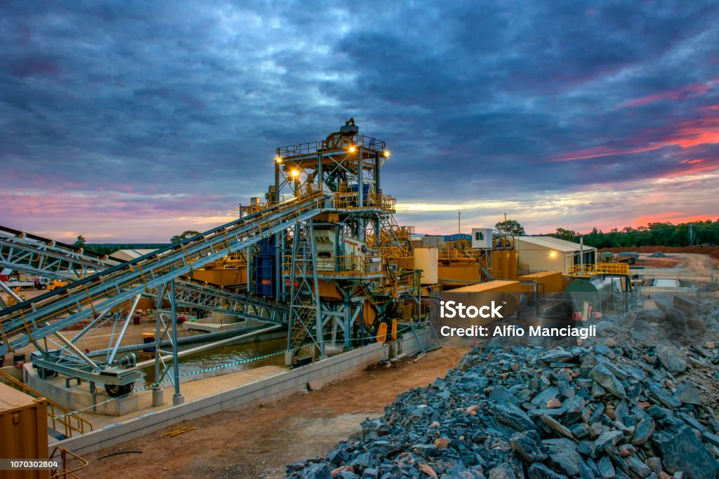 As a data analyst, my role in this project involves identifying key quality predictors for a mining process. The primary objective is to use this data to forecast the level of impurities in the ore concentrate. Since impurity levels are measured hourly, predicting the silica content (an impurity) in the ore concentrate can provide engineers with early warnings, enabling them to take proactive measures. This allows them to reduce impurities efficiently and minimize environmental impact by decreasing the amount of ore sent to tailings.
R | IBM HR Analytics Employee Attrition & Performance
 See how I explore how to analyze key factors like employee performance and attrition using powerful tools like correlation matrices, scatter plots, and hypothesis testing. This experience has been a game-changer in enhancing my data analysis skills and understanding how R can uncover valuable insights.
Tableau 2023-24 NBA Stats and Analysis
 Data analysts frequently encounter scenarios where key data insights can significantly impact decision-making. What narrative does the data reveal, and what insights can drive change? I recently explored this through a project on NBA player statistics. In my PowerPoint, I discuss my rationale for each visualization type and highlight key findings in the NBA Stats Project.
Excel | Market Research & Analysis - Food Delivery
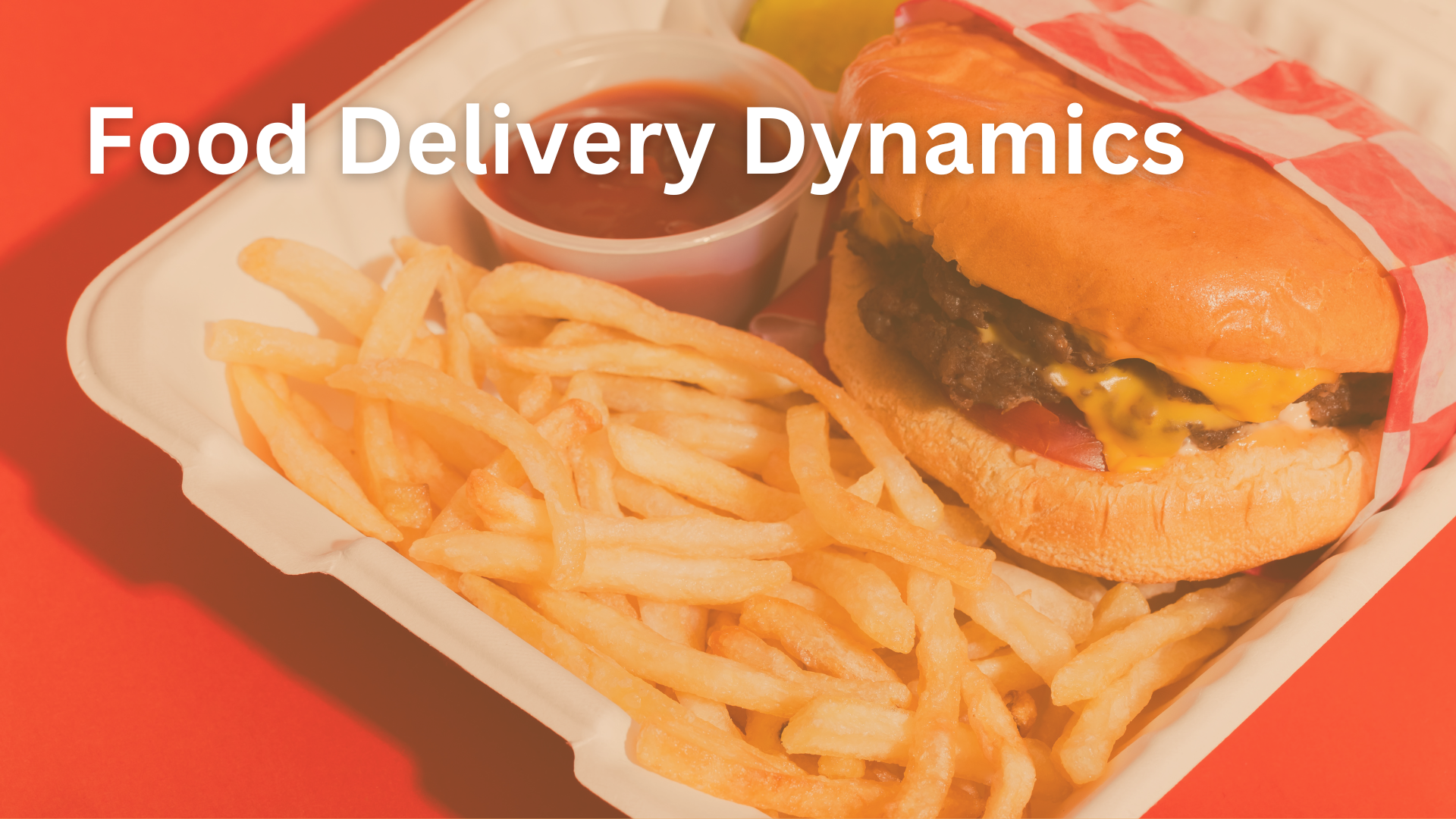 For this project, I meticulously cleaned a dataset comprising 2000 rows. Leveraging this data, I crafted insightful visualizations aimed at providing valuable market insights. The primary emphasis of my project was to uncover spending trends and translate this information.
Tableau Massachusetss Education Dashboard
Loom Video Overview
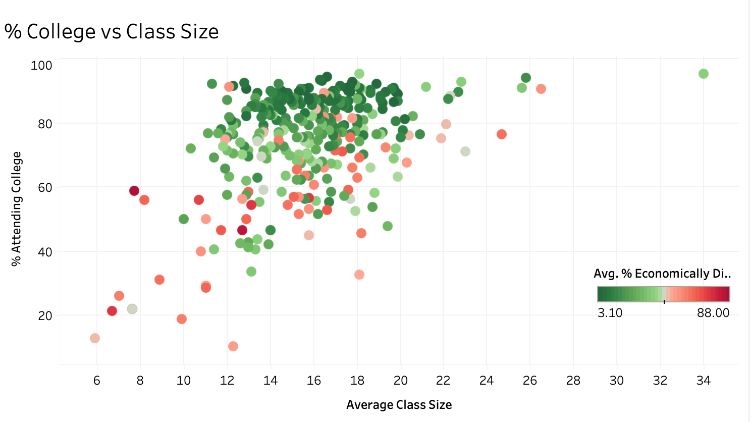 The Massachusetts Education Overview is a recent project that showcases a Tableau dashboard created from The Massachusetts Department of Education’s database. The project aims to provide useful information for superintendents, including graduation rates, school performance, class size vs college attendance, and 4th-grade math level. The report provides a comprehensive overview of education in Massachusetts and offers insights that can help improve the educational system.
Public Health Analyst Insights - Opioid Abuse Prevention
 The Opioid Abuse Prevention website is a site that I designed myself during my undergraduate studies that is filled will research and insights regarding the Opioid Overdose Epidemic specifically in Ohio.